Style Customization
Please be aware that this structure can change - changes to the structure or similar will be communicated within this page.
Basic configuration
The panel allows the hotelier to modify the basic configuration for styles.
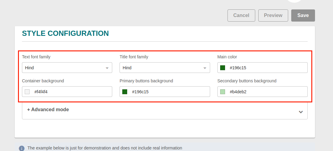
| Configuration | Description |
|---|---|
| Text font family | Global font family (descriptions, amenities, prices, buttons, etc) |
| Title font family | Headings font family (property name, room name, rate plan name, etc) |
| Main color | Brand main color (search bar background, links) |
| Container background | Page background |
| Primary buttons background | Main buttons background color (select property, select rate plan, etc) |
| Secondary buttons background | Secondary action buttons background color (modify search, continue to checkout in special offers page, etc) |
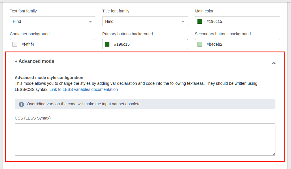
Advanced configuration
Also, the panel has an advanced mode that allows the hotelier or web agency to apply CSS/LESS logic by using the detailed LESS/CSS classes or creating new ones.
Global variables
| Variable | Default | Description |
|---|---|---|
| @mainColor | #ffffff | Brand main color |
| @secondaryColor | #555555 | Brand secondary color |
| @containerBackground | #f5f5f5 | Site background color |
| @buttonsBackground | #459ba9 | Buttons main color |
| @baseFontFamily | Lato | KBE font family |
| @headingsFontFamily | Lato | Headings font family (h1 - h6) |
Font colors and sizes
| Variable | Default | Description |
|---|---|---|
| @mainColorDark | darken(@mainColor, 5%); | On hover background color of the dropdown component in the user toolbar at the top right corner |
| @accentColor | @mainColor | Color to highlight important elements |
| @baseFontSize | 14px | KBE default font size |
| @baseLineHeight | 1.5 | KBE default line-height |
| @baseFontColor | #333333 | KBE default font color |
| @baseSearchFontColor | @buttonsBackground | Font color within the input fields of the main search box |
| @baseSearchLabelFontColor | @baseFontColor | Font color of the input fields' labels of the main search box |
| @colorOverContrast | contrast(@mainColor) | Color of the text displayed over a section that has @mainColor as background-color |
| @colorOverContrastHover | darken(contrast(@mainColor), 5%) | Color of the text displayed over a section that has @mainColor as the background color when is :hover |
Cards
| Variable | Default | Description |
|---|---|---|
| @cardBackground | #ffffff | KBE cards background color |
| @cardColor | @baseFontColor | KBE cards font color |
| @cardColorSecondary | lighten(@baseFontColor, 40%) | KBE cards support text font color |
Radiuses and box-shadows
| Variable | Default | Description |
|---|---|---|
| @baseBorderRadius | 0 | Global border-radius to all components (inputs, modals, buttons, etc) |
| @baseContainerBoxShadow | 0 2px 4px 0 #959595 | Box shadow on containers and main search box |
| @borderSearchInputRadius | 12px | Border radius of the input fields in the main search box |
| @baseBorderRadiusCommon | 15px | Standard border radius |
| @baseBorderRadiusCard | @baseBorderRadiusCommon | Card border radius |
| @baseBorderRadiusImage | @baseBorderRadiusCommon | Image border radius |
| @baseBorderRadiusButton | @baseBorderRadiusCommon | Button border radius |
| @baseBorderRadiusLabel | @baseBorderRadiusCommon | Highlight label border radius |
Links
| Variable | Default | Description |
|---|---|---|
| @linksColor | @buttonsBackground | Links color |
| @linksColorHover | darken(@linksColor, 5%) | Links color on :hover |
| @linksColorActive | darken(@linksColor, 10%) | Links color on :active |
Headings
| Variable | Default | Description |
|---|---|---|
| @headingsFontColor | @baseFontColor | Headings color |
| @h1FontFamily | @headingsFontFamily | <h1> font family |
| @h1FontColor | @headingsFontColor | <h1> font color |
| @h1FontWeight | 700 | <h1> font weight |
| @h1TextTransform | none | <h1> text-transform property |
| @h2FontFamily | @headingsFontFamily | <h2> font family |
| @h2FontColor | @headingsFontColor | <h2> font color |
| @h2FontWeight | 700 | <h2> font weight |
| @h2TextTransform | none | <h2> text-transform property |
| @h3FontFamily | @headingsFontFamily | <h3> font family |
| @h3FontColor | @headingsFontColor | <h3> font color |
| @h3FontWeight | 700 | <h3> font weight |
| @h3TextTransform | none | <h3> text-transform property |
| @h4FontFamily | @headingsFontFamily | <h4> font family |
| @h4FontColor | @headingsFontColor | <h4> font color |
| @h4FontWeight | 700 | <h4> font weight |
| @h4TextTransform | none | <h4> text-transform property |
| @h5FontFamily | @headingsFontFamily | <h5> font family |
| @h5FontColor | @headingsFontColor | <h5> font color |
| @h5FontWeight | 700 | <h5> font weight |
| @h5TextTransform | none | <h5> text-transform property |
| @h6FontFamily | @headingsFontFamily | <h6> font family |
| @h6FontColor | @headingsFontColor | <h6> font color |
| @h6FontWeight | 700 | <h6> font weight |
| @h6TextTransform | none | <h6> text-transform property |
Buttons
Basic Buttons
| Variable | Default | Description |
|---|---|---|
| @buttonBasicBackground | rgba(0, 0, 0, 0) | Basic button background color |
| @buttonBasicBorderColor | @buttonsBackground | Basic button border-color |
| @buttonBasicFontFamily | @baseFontFamily | Basic button font family |
| @buttonBasicFontColor | @buttonsBackground | Basic button font color |
| @buttonBasicFontWeight | bold | Basic button font weight |
| @buttonBasicBorderRadius | @baseBorderRadiusButton | Basic button border radius |
| @buttonBasicTextTransform | none | Basic button text-transform property |
| @buttonBasicBoxShadow | 0 0 0 0 rgba(0, 0, 0, 0) | Basic button box-shadow property |
| @buttonBasicTextShadow | 0 0 0 0 rgba(0, 0, 0, 0) | Basic button text-shadow property |
| @buttonBasicHoverBackground | @buttonBasicBorderColor | Basic button background color on :hover |
| @buttonBasicHoverBorderColor | @buttonBasicHoverBackground | Basic button border color on :hover |
| @buttonBasicHoverFontColor | contrast(@buttonBasicHoverBackground, mix(#FFFFFF, @buttonBasicHoverBackground, 90%), @baseFontColor) | Basic button font color on :hover |
| @buttonBasicHoverBoxShadow | @buttonBasicBoxShadow | Basic button box-shadow property on :hover |
| @buttonBasicHoverTextShadow | @buttonBasicTextShadow | Basic button text-shadow property on :hover |
| @buttonBasicActiveBackground | mix(#000000, @buttonBasicHoverBackground, 10%) | Basic button background color on :active |
| @buttonBasicActiveBorderColor | @buttonBasicActiveBackground | Basic button border color on :active |
| @buttonBasicActiveFontColor | contrast(@buttonBasicActiveBackground, mix(#FFFFFF, @buttonBasicActiveBackground, 90%), @baseFontColor) | Basic button font color on :active |
| @buttonBasicActiveBoxShadow | @buttonBasicHoverBoxShadow | Basic button box-shadow property on :active |
| @buttonBasicActiveTextShadow | @buttonBasicHoverTextShadow | Basic button text-shadow property on :active |
Primary Buttons
| Variable | Default | Description |
|---|---|---|
| @buttonPrimaryBackground | @buttonsBackground | Primary button background color |
| @buttonPrimaryBorderColor | @buttonPrimaryBackground | Primary button border color |
| @buttonPrimaryFontFamily | @baseFontFamily | Primary button font family |
| @buttonPrimaryFontColor | contrast(@buttonPrimaryBackground, mix(#FFFFFF, @buttonPrimaryBackground, 90%), @baseFontColor) | Primary button font color |
| @buttonPrimaryFontWeight | 700 | Primary button font weight |
| @buttonPrimaryBorderRadius | @baseBorderRadiusButton | Primary button border radius |
| @buttonPrimaryTextTransform | none | Primary button text-transform property |
| @buttonPrimaryBoxShadow | 0 0 0 0 rgba(0, 0, 0, 0) | Primary button box-shadow property |
| @buttonPrimaryTextShadow | 0 0 0 0 rgba(0, 0, 0, 0) | Primary button text-shadow property |
| @buttonPrimaryHoverBackground | mix(#000000, @buttonPrimaryBackground, 10%) | Primary button background color on :hover |
| @buttonPrimaryHoverBorderColor | @buttonPrimaryHoverBackground | Primary button border color on :hover |
| @buttonPrimaryHoverFontColor | contrast(@buttonPrimaryHoverBackground, mix(#FFFFFF, @buttonPrimaryHoverBackground, 90%), @baseFontColor) | Primary button font color on :hover |
| @buttonPrimaryHoverBoxShadow | @buttonPrimaryBoxShadow | Primary button box-shadow property on :hover |
| @buttonPrimaryHoverTextShadow | @buttonPrimaryTextShadow | Primary button text-shadow property on :hover |
| @buttonPrimaryActiveBackground | mix(#000000, @buttonPrimaryHoverBackground, 10%) | Primary button background color on :active |
| @buttonPrimaryActiveBorderColor | @buttonPrimaryActiveBackground | Primary button border color on :active |
| @buttonPrimaryActiveFontColor | contrast(@buttonPrimaryActiveBackground, mix(#FFFFFF, @buttonPrimaryActiveBackground, 90%), @baseFontColor) | Primary button font color on :active |
| @buttonPrimaryActiveBoxShadow | @buttonPrimaryHoverBoxShadow | Primary button box-shadow property on :active |
| @buttonPrimaryActiveTextShadow | @buttonPrimaryHoverTextShadow | Primary button text-shadow property on :active |
Secondary Buttons
| Variable | Default | Description |
|---|---|---|
| @buttonSecondaryBackground | @secondaryColor | Secondary button background color |
| @buttonSecondaryBorderColor | @buttonSecondaryBackground | Secondary button border color |
| @buttonSecondaryFontFamily | @baseFontFamily | Secondary button font family |
| @buttonSecondaryFontColor | contrast(@buttonSecondaryBackground, mix(#FFFFFF, @buttonSecondaryBackground, 90%), @baseFontColor) | Secondary button font color |
| @buttonSecondaryFontWeight | 700 | Secondary button font weight |
| @buttonSecondaryBorderRadius | @baseBorderRadiusButton | Secondary button border radius |
| @buttonSecondaryTextTransform | none | Secondary button text-transform property |
| @buttonSecondaryBoxShadow | 0 0 0 0 rgba(0, 0, 0, 0) | Secondary button box-shadow property |
| @buttonSecondaryHoverBackground | mix(#000000, @buttonSecondaryBackground, 10%) | Secondary button background color on :hover |
| @buttonSecondaryHoverBorderColor | @buttonSecondaryHoverBackground | Secondary button border color on :hover |
| @buttonSecondaryHoverFontColor | contrast(@buttonSecondaryHoverBackground, mix(#FFFFFF, @buttonSecondaryHoverBackground, 90%), @baseFontColor) | Secondary button font color on :hover |
| @buttonSecondaryHoverBoxShadow | @buttonSecondaryBoxShadow | Secondary button box-shadow property on :hover |
| @buttonSecondaryActiveBackground | mix(#000000, @buttonSecondaryHoverBackground, 10%) | Secondary button background color on :active |
| @buttonSecondaryActiveBorderColor | @buttonSecondaryActiveBackground | Secondary button border color on :active |
| @buttonSecondaryActiveFontColor | contrast(@buttonSecondaryActiveBackground, mix(#FFFFFF, @buttonSecondaryActiveBackground, 90%), @baseFontColor) | Secondary button font color on :active |
| @buttonSecondaryActiveBoxShadow | @buttonPrimaryHoverBoxShadow | Secondary button box-shadow property on :active |
Loading Blocks
| Variable | Default | Description |
|---|---|---|
| @loading-block-gradient-background | @cardBackground | Loading Block background color |
| @loading-block-gradient-background-loading | darken(@cardBackground, 10%) | Loading Block background accent color |
| @loading-block-gradient | linear-gradient(to right, darken(@loading-block-gradient-background, 5%) 10%, @loading-block-gradient-background-loading 18%, darken(@loading-block-gradient-background, 5%) 30%) | Loading Block gradient generator |
Marketing Labels
| Variable | Default | Description |
|---|---|---|
| @marketingLabelsColor | #2220aa | Marketing Labels default color |
| @marketingLabelsPositionAColor | @marketingLabelsColor | Marketing Labels in position A color |
| @marketingLabelsPositionBColor | @marketingLabelsColor | Marketing Labels in position B color |
| @marketingLabelsPositionCColor | @marketingLabelsColor | Marketing Labels in position C color |
| @marketingLabelsInPropertiesList | @marketingLabelsColor | Marketing Labels in properties list color |
| @marketingLabelsInCarouselsColor | @marketingLabelsColor | Marketing Labels in carousels |
| @marketingLabelsInPropertyProfile | @marketingLabelsColor | Marketing Labels in property profile |
| @marketingLabelsInPropertiesListPositionAColor | @marketingLabelsColor | Marketing Labels in properties list and position A color |
| @marketingLabelsInPropertiesListPositionBColor | @marketingLabelsColor | Marketing Labels in properties list and position B color |
| @marketingLabelsInPropertiesListPositionCColor | @marketingLabelsColor | Marketing Labels in properties list and position C color |
| @marketingLabelsInPropertyProfilePositionAColor | @marketingLabelsColor | Marketing Labels in property profile and position A color |
| @marketingLabelsInPropertyProfilePositionBColor | @marketingLabelsColor | Marketing Labels in property profile and position B color |
| @marketingLabelsInPropertyProfilePositionCColor | @marketingLabelsColor | Marketing Labels in property profile and position C color |
| @rewards-highlighted-color | #ecf8fe | Rewards program highlight label color |
| @labelColorRed | #c64343 | Standard marketing label red color |
| @labelColorOrange | #ea9b42 | Standard marketing label orange color |
| @labelColorYellow | #f0b715 | Standard marketing label yellow color |
| @labelColorGreen | #5fa562 | Standard marketing label green color |
| @labelColorBlue | #4a6f9f | Standard marketing label blue color |
| @labelColorOceanblue | #459ba9 | Standard marketing label ocean blue color |
| @labelColorTeal | #00b5ad | Standard marketing label teal color |
| @labelColorPurple | #764a9f | Standard marketing label purple color |
| @labelColorPink | #d87ba2 | Standard marketing label pink color |
| @labelColorMagenta | #e41c5f | Standard marketing label magenta color |